12.10.21 to 27.10.21
I have a bit of habit of getting a new idea very minute so I often make a lot of very messy notes in order to keep myself in check, my mother was a nurse and my dad was a doctor I was doomed to have horrible handwriting from the day I was born.
So there's some notes I have written up in the past weeks coming up to halloween. Sorry if it's bit much all in one blog post but I've been been putting off the written research side of things because it's by least favourite part of any project, despite it being the most important.
So here We have some of my earliest notes. I previously did some research into my target demographic as far back as 31.9.2021 but that was more in terms of production and studios I would like to work for one day.
So here We have some of my earliest notes. I previously did some research into my target demographic as far back as 31.9.2021 but that was more in terms of production and studios I would like to work for one day.

But these newer in these newer notes I am looking at the general cost of production as well as list shows that are similar to what I am trying to achieve and should watch as well as a few shows I thought were interesting or unusual and interesting. I wanted to have the world have a handmade look to it so I also looked into shows hand used elements of arts and crafts into the design.
Thankfully my lectures both had children so just talking to them with the idea really helped get an idea on what children are like.
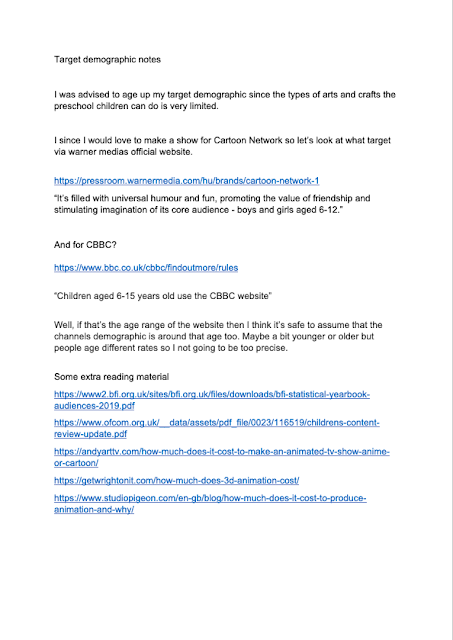
The original pitch for the show was aimed at a much younger audience but after it really hard to come up crafting ideas that don't require of scissors I decided to aim for an older audience for safety reasons. As such things are going to have to be aged up from preschoolers to an age range of roughly 4 to 8 years old.
The original pitch for the show was aimed at a much younger audience but after it really hard to come up crafting ideas that don't require of scissors I decided to aim for an older audience for safety reasons. As such things are going to have to be aged up from preschoolers to an age range of roughly 4 to 8 years old.

The notes read-
"Andyarttv.com- for a 2D children's show like Steven Universe or Fairy Odd Parents your talking anywhere between $300,000 or 600,000 per episode.
"Andyarttv.com- for a 2D children's show like Steven Universe or Fairy Odd Parents your talking anywhere between $300,000 or 600,000 per episode.
IBC.org- there's more demand for streaming or video on demand style content.
In 2017 the BBC launched various apps for children such as Own It, Get Creative and Go Explore."
Note- I am not sure if I remember where I got this information from and in fact looking at these notes now these are some terrible sources. The closet I found when looking up for IBC.org and articles on streaming I found two totally separate articles.
I note my phone is about to die so I had to cut my research short and I write down some notes as I am talking to the lecture about my idea.
"How will I achieve the art making sections? How do I keep children safe? Maybe I should have adult characters rather than having full life action segments?"
"How will I achieve the art making sections? How do I keep children safe? Maybe I should have adult characters rather than having full life action segments?"
the last one is a bit confusing so let me explain, I didn't know if I wanted to have the carton character be the one to do the arts and crafts or have a separate live actor to play that role.

I was then asked to create a description for my character so I quickly wrote down this along side his old bobble-head design.
It was supposed to read as such, give or take a few spelling and grammar corrections;
"Our main character is a young beaver with a love of things arts and crafts. Whilst he gets a bit huffy when things don't go his way he ultimately always willing to help those in need,"
As well as the main character we have his best friend who also got a description;
"His best friend is a human girl with paintbrush hair and a paint palette hat. She is not as outgoing has out main beaver but she's often more level-headed,"

I also have designs for various characters that would inhabit the world which I start developing by getting those initial ideas down on paper despite most being the best examples of character design or fine art it's important for me to get my terrible first ideas out first so I can get them out my system.
Some of these design would go on the developed further, some are rejected straight away and others have interesting ideas I want to develop but the design doesn't look all too great.
One design I liked in concept but couldn't get to look right was having character based on the shape of a music note but I couldn't come up with design that looked quite right. starting off with a squirrel like character but that didn't look all too good. then I went with a Japanese samurai but than didn't go with the theme of music and I tired to used a different musical note but I decided to stop and come back to the idea latter on.


I also used the blank space I had to develop my main character further trying to stem away from the bobble head design to make something that looks more beaver like and less a generic bear. Looking at actual beavers, their bodies are much bigger than their heads with a long face.
I think the most useful thing I did was making a very quick chart between two extremes and narrowing it down to the exact proportions I liked which was to have the body and head around the same size with maybe the head being slightly smaller than the head.


sketches of the head go smudged on the way back from the campus which is a shame but I these sorts of things happen when working with traditional media.


I loved cutting shapes out of paper and I couldn't help myself but to try cutting out some basic shapes from black paper. Sometimes doing this is good for silhouettes but really I just something thats nice to do.
Once I got some advice and enough sketches I imported some of my sketches and some pictures of real beavers some started developing my design further.

Here I redid some silhouette style sketches playing a bit more with various extremes.
Got tired half way through so thats why you see those doodles at the bottom right corner.
Got tired half way through so thats why you see those doodles at the bottom right corner.

I then focused solely on the face, using the symmetry tool in photoshop just to keep things constant. At time the face looked more like that of a koala bear than a beaver since I would make the nose too big. I also struggled to take the advice to push the face up some I stuck my guns for the most part. After I had most of the page full I asked my mum which ones she liked the most, she loves cute things and there wasn't anyone else around me at the time to ask directly.
The red marks indicate which ones I or my mum liked.
The red marks indicate which ones I or my mum liked.

I took these design concepts and developed them into this design. which was the next major design development
Wrote down the notes for improvement given to me by my lecture and peers. Which where;
1. Looks too much like a bear
2. It still looks too generic
3. Push the face higher on the head
4. Tail need to be lower down on the body

I couldn't be bothered to redraw the same body over an over so I made myself a base I could work off of. I made two versions but I ended up just using the smaller of the two. I also put them in a t pose just so I could work on the arms a bit easier.


Next came a series of deigns which more involved small teaks til I had a design I liked.
First design was close to what i already had. The new smaller fave made in hard to fit in the large eyes without it looking weird.
First design was close to what i already had. The new smaller fave made in hard to fit in the large eyes without it looking weird.

Next, I shrunk down the eyes and made the nose bigger. Removed the paint splatters but just so I can focus of the design more.
i find myself liking the smaller button eyes so I continue to make the eyes smaller.

Tried playing around with the eyes more looking at a really beaver for ideas. Having the eyes so far apart made then look older than I wanted and even a little strange.

Moved the eyes down and more level to the nose. Added in eyebrows for more expressiveness. tried bring back the tooth gap and gave him a bigger smile.

Made the nose smaller and give him more a cats mouth. However, the teeth were too small for my liking.

Since I made the teeth too small I decide to make them even bigger. This worked surprisingly well.


There is all the major designs as I went along. He didn't stay skinny for very long. The tuff of hair on the top and the freckles were additions I added in very early on. The freckles were added because real beavers appear to have whiskers and the freckles where not only simpler to do but made him look or childlike or mischievous.
All versions of the design have the apron and shorts combo, very stylish!


Comments
Post a Comment