1.10.2021
Module AND218- Week 1
Mood board, Sketches and Concepts.
I made some mood boards using the PureRef application it's a useful tool but it doesn't have feature for adding notes has it's really more of tool you would have on the side. So I used online tools to make text images in my mood boards.
I prefer to do mood boards first has I don't always have a clear idea on what I want from a design. That being said I had a very good idea on what I wanted for one of the side characters so I come up with a mood board for that first so I can get it out of my mind.
 I had the idea of a character using their hair like a a paintbrush which I have seen people design characters which use there tails as a paint brush I haven't seen it done with hair to my knowledge.
I also fell in love with the character design for ENA from the web cartoon of the same name. The show has some of the most unique designs and ENA herself was stated to be based on the works of Pablo Picasso so I had the idea of making a character based on a famous painting myself, namely Starry Starry Night by Van Gogh but never really developed that idea. When I decided I should go with the idea of a world made of arts and crafts I remembered that idea for a character themed around painting
Though the Van Gogh influence is not had much there anymore in the mood board it did give me a good idea for what I want in this design. I also wanted to play around with the idea of a hat if a paint palette shape for the hats brim and some sort of cute black dress.
For the main character I had less of an idea but I looked forward the works of Rodney Greenblat and Jon Burgerman for some inspiration as well as traditional cute animals such as dogs, bear and rabbits. Though the rabbit element was removed early on as . The goal with this design was to make something that would appeal to the younger demographic I was aiming for whilst also being somewhat soothing and comforting it their design.  This is were I started to look briefly at basic colour psychology. It's hard to say if there's is an excact science to to colour but from what I had gathered was that the warm colours tend to make people more alert whilst the cooler colours tend to make people calmer. I also think might be a similar effect when it comes to the saturation of the colour though there's not real study to prove that, either way I decided that when it came time to colouring the character i wanted to used less saturated colours and aim more towards more earthy and pastel colours has they seem to be easier on the eyes. I also choose to use rounded shapes when it came to designing the character as they give everything a more friendly appearance.
I struggled somewhat with the clothes has unlike the side characters I wanted to have a general feeling a arts and crafts with the character so I tired looking up the kinda of clothes people wear whilst working as a artisan which boiled down having some either an apron or overalls and as for the shirt I stuck to the classic stripped shirt. which then became a T shirt with a long sleeved shirt underneath.
For the world I really wanted to have an handmade feel to it so I looked at mix of pre-existing games and shows that I felt captured the look well, like Charlie and Lola, Sarah & Duck and Yoshi's Crafted World as well as kids shows that I noticed even adults enjoyed like Bluey.
But where most of my research came in was looking at real arts and crafts and paper art. Skies made from acrylic paint with cotton wool clouds, paper trees and leaves made from actual life leave prints. I even bought tons of arts and craft supplies to experiment with which I only got to do a little bit of this week but hopefully I'll get to use in future.

This part was a mistake on my part as was I misread and got this mixed up with my 3D games development project. The project required me to make some sort of prop which I ended up making a mood board for this project instead.
But I suppose more research can never be a bad thing.
So I was wondering what I could do for a item for my character and I immediately though, 'well he need somewhere if hold all his craft supplies'.
So that went I started to develop a design for either box or backpack. It was going to be a box but I thought if a backpack you could keep both hands free.
Backpacks designs for solely for artists tends to be more rectangular than normal which is likely just to keep things like sketch books and laptops in.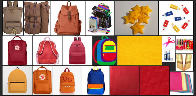
So this is where all the new stuff comes into play. With all the elements in place a start by drawing out some basic shape I though I might use which then moved on to creating quick silhouettes where I played to proportions. By starting with the silhouettes first it gets you to forces you to think about the overall design and now to focus of the finer details just yet, it an specially good technique to use then making a line up of characters because trying to think about how all these characters will look standing side to side.
once I had a shape I wanted to work with I started to create some rough sketches of the characters, and for the sake of time I even used the symmetry tool to that details such as the eyes and and ears would stay constant. I took heavy influence from Japanese mascots with their more exaggerated baby like features such as having a much larger, rounder head paired with a body that is one and half heads big, real babies have a one head to two heads body proportionally.
Half way designing the character I though that perhaps I should try making this character a beaver instead of a bear since beavers are well known for building things. So I tried adding beaver like features such as a larger nose, buck teeth and the iconic flat tail. So what came up as a random thought inside my head turned out to be a really good design and I can't wait to develop this character further. 
I then started played with some of the crafts supplies I had though I had a bit of a habit of trying to throw things away hence the crumpled look. thankfully I manged to scan them in. 
These where mostly pen though I had bought some finger paints to try but they were actually terrible. They had weak pigmentation to them and also they had funny smell to them, almost like play dough. So I did switch back to proper acrylics quite quickly which is a shame because I got some really good looking tree designs having pen for the trunk and paint for the leaves, it was a very nice mixed media effect.
Afterwards, I tired using paper cut outs and ripped paper which also had a really nice effect, especially for mountain ranges and hills has the ripped paper has is a rugged look to it.
Some examples of various mark making which I do to test the properties for certain materials. This included most of the pens, acrylic paint with both finger prints and paint brush, crayons and some cheap neon oil pastels I bought form the pound shop.

So I had to have two ideas for this project which I actually was thinking about something that I though would be useful. This idea came about from me thinking about memories of all things. How fragile and often unclear they are like a VHS tapes that have been rewritten, water logged and damaged in time.
And somehow that made me think of old film reels which were even worse for getting lost as the cellulose in them was extremely flammable. That soon became this idea of a theatre of dreams where memories are archived on old film reels. If not treat well would become damaged for fade away in time.
So I since I already had this new idea bouncing around inside my head I thought I could try and make it more child friendly. So the idea of dreams where focused on instead. A lot of the more dreamlike images actually came form one website called https://cari.institute/ which is a online group project designs to name and catalogue the various movements or styles seen within product design with the modern era. it's also a great place to find textbook quality images for product design, interior design and period specific marketing. I wanted to give the theatre a familiar but dream like feel to it in.
As for the reels and projector themselves I wanted them to also have this magical of toy like feel to them with lots of blues and purples with star shaped prongs. If it was to me made in 3D I think I would be nice give the film itself a holographic effect to it.
so this is where things start to unfortunately get to feel a bit rushed, I needed to provide thumbnails for my ideas but I ended up spending so much time with my mood board that some of art suffered for it. For the first lot I played around with what the house could look like. Backgrounds are something I personally struggled with but I am really happy with how things turned out lot of experimenting with digital paint brushed which were the one that came with my version of Krita. I quite like the second idea I had which was having the house reflect want art form the character represents, though I ended up with two paint house for the thumbnail. I also had made some very quick silhouettes for other potential characters as well as my first attempt at my painter girl who has become a bit of a favourite of mine.

I made some mood boards using the PureRef application it's a useful tool but it doesn't have feature for adding notes has it's really more of tool you would have on the side. So I used online tools to make text images in my mood boards.
I prefer to do mood boards first has I don't always have a clear idea on what I want from a design. That being said I had a very good idea on what I wanted for one of the side characters so I come up with a mood board for that first so I can get it out of my mind.
I also fell in love with the character design for ENA from the web cartoon of the same name. The show has some of the most unique designs and ENA herself was stated to be based on the works of Pablo Picasso so I had the idea of making a character based on a famous painting myself, namely Starry Starry Night by Van Gogh but never really developed that idea. When I decided I should go with the idea of a world made of arts and crafts I remembered that idea for a character themed around painting
Though the Van Gogh influence is not had much there anymore in the mood board it did give me a good idea for what I want in this design. I also wanted to play around with the idea of a hat if a paint palette shape for the hats brim and some sort of cute black dress.
For the main character I had less of an idea but I looked forward the works of Rodney Greenblat and Jon Burgerman for some inspiration as well as traditional cute animals such as dogs, bear and rabbits. Though the rabbit element was removed early on as . The goal with this design was to make something that would appeal to the younger demographic I was aiming for whilst also being somewhat soothing and comforting it their design.
I struggled somewhat with the clothes has unlike the side characters I wanted to have a general feeling a arts and crafts with the character so I tired looking up the kinda of clothes people wear whilst working as a artisan which boiled down having some either an apron or overalls and as for the shirt I stuck to the classic stripped shirt. which then became a T shirt with a long sleeved shirt underneath.
For the world I really wanted to have an handmade feel to it so I looked at mix of pre-existing games and shows that I felt captured the look well, like Charlie and Lola, Sarah & Duck and Yoshi's Crafted World as well as kids shows that I noticed even adults enjoyed like Bluey.
But where most of my research came in was looking at real arts and crafts and paper art. Skies made from acrylic paint with cotton wool clouds, paper trees and leaves made from actual life leave prints. I even bought tons of arts and craft supplies to experiment with which I only got to do a little bit of this week but hopefully I'll get to use in future.
But I suppose more research can never be a bad thing.
So that went I started to develop a design for either box or backpack. It was going to be a box but I thought if a backpack you could keep both hands free.
Backpacks designs for solely for artists tends to be more rectangular than normal which is likely just to keep things like sketch books and laptops in.
So I since I already had this new idea bouncing around inside my head I thought I could try and make it more child friendly. So the idea of dreams where focused on instead.
I then made some sketches for my theatre concept. And while feeling like was done on sort notice I am actually really impressed with how the building sketches came out and well as the view of the cinema screen itself.
this also gave me a change to create some new characters on the fly which got me to get down my first ideas which is always a got way of getting the bad ideas out the way first and start to began developing better ideas from there.
Though having a giraffe on the boom mic has to be one of my best achievements as a aspiring designer ha ha.

Anyways, I have a another project coming down the pipeline that I'll need to focus on and I am not sure how much I will want to share of that since I am planning to pitch this one to developers. I am not sure if that will happen but I won't know until try.


Comments
Post a Comment