Shadow puppet work and Pixilation
Team Gilliam - Project 1 - Attraction


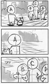
I made some rough storyboards on posted notes I had around the house. Though they looked very pretty I was told they weren't all to clear to read so I tired to simplify things a lot more. Some scenes were also not do able with the equipment that we had around the house so the opening part was simplified to just a zoom into the bookcase.
Here are version iterations of the storyboard. You can see in the later ones that the art style is constantly changing and that's because unlike I want you might see in a studio where there's team that solely works on the story board. Yet because of Covid restrictions we were going through at the time and just how small our team was we decaded that everyone would storyboard there own parts. Once that was done we would merge them together in a basic video editing software to get a feel for how everything would looks.
With this in mind we had to communicate clearly what happed within each scene so that the next person could then follow along from there. we also than to have the general design on what the main character would look like so we had her have wear a dress and have curly hair which was worn has pony tails or hair buns.
I personally imaged her being black but but its really up to interpretation in that regard.
Normally, went your storyboarding you should have some sort of grid to get a feel for where the "camera" would be.
Here's just a basic example to took from google images.
But for the scenes that involved my shadow puppets I didn't really think I would need to add much detail into my storyboard because of how flat everything would look. Though I do wish I put more thought into the timing of certain scenes.
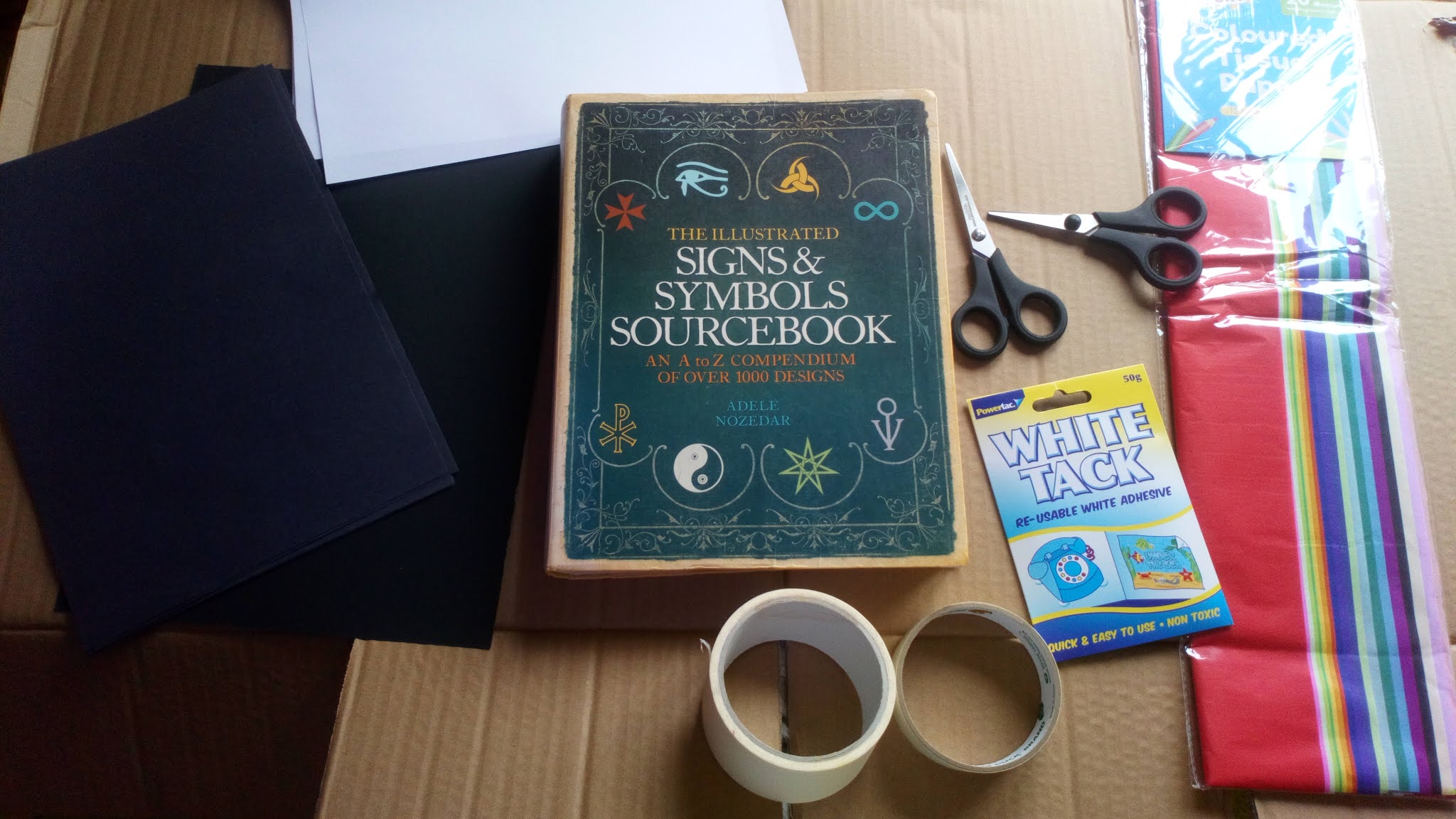
My materials of choice. It's somewhat amazing what you can do with stuff you have lying around the house.

Got this led light board as a gift from my friends. Has become a useful tool for me went we were all still in lockdown.


The lecturer recommend I try taping on some tissue paper to prevent any sort of glare. If the advice is free then I see no reason not to try it.
It even came with the added bonus of giving the piece more texture.


Blocking out the figure before adding in detail.

I prefer to work with scissors for the most part but a craft knife is still always handy to have to any small, fiddly bits.
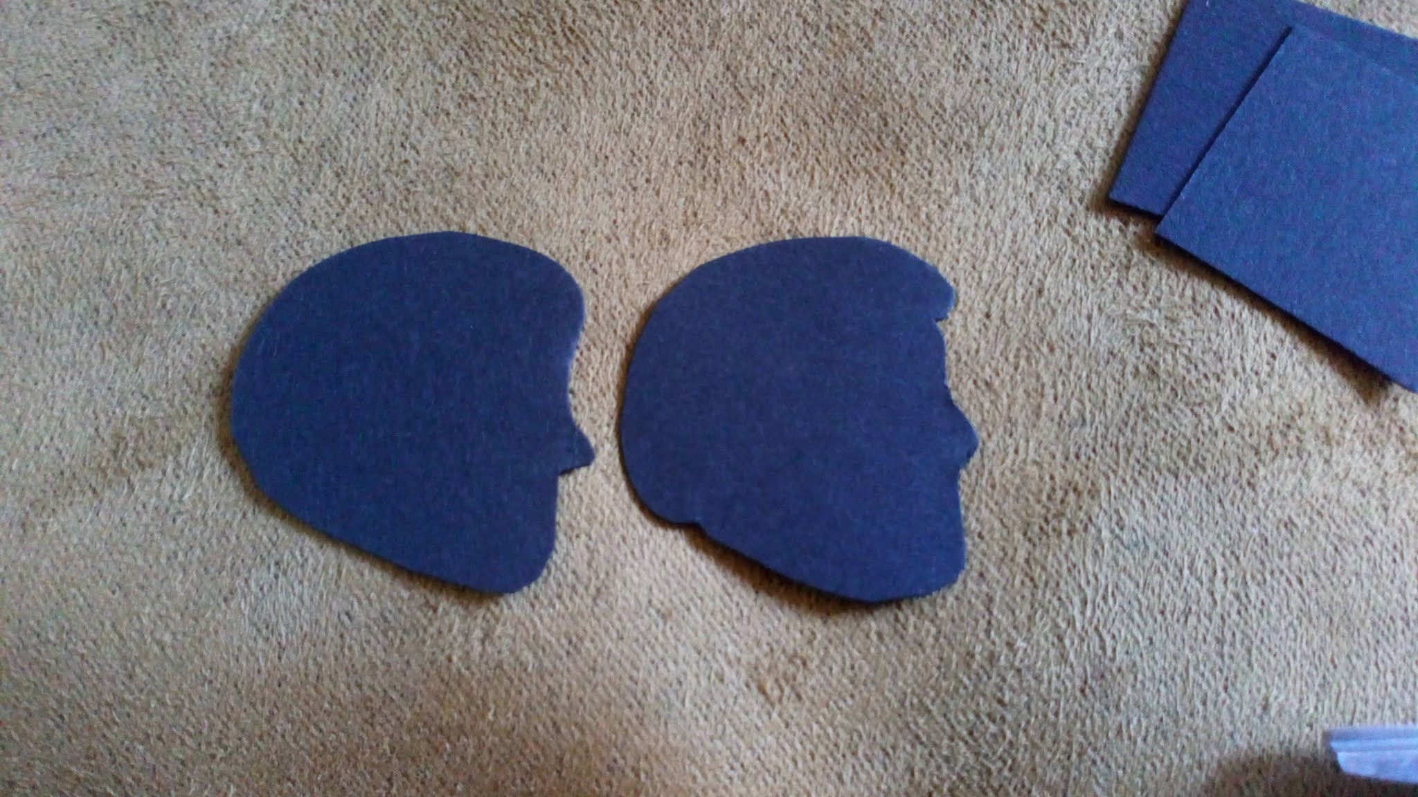


Starting to cut out the characters. I added in joints for arms, legs, torso and toes. I even added in flexibility into the hair so allow it to move freely as a posed the characters.


Testing how it would look once the light was on.


My first attempt at making the book didn't go so well as the brown blended in with the bookcase itself and and it really didn't stand out. It's was a bit annoying when it got a rid in it because it was a book I've had for quite some time.
 The second attempt went a lot better. Found some sticky back holographic paper that looked really nice and we were going to throw away some old cook books so I just used one of them. Modelled the design loosely on one of my dragonology books I had since I was a child.
 Taped some copper wire to a piece of paper to a could flip one of the pages without getting my hand into the shot. Can't remember if I actually used this as I remember to wire showing through the paper once the lights were on.
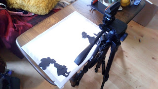 My set up for filming the animated scene. A tripod, light board for underlighting and a single light wrapped around my chair for the book opening sequence. Did think about buying some Perspex but never did.


Comments
Post a Comment